Front Page

The main landing page that introduces users to the site. It typically provides an overview of the product or project, key links to sections. Its primary purpose is to help users quickly orient themselves and navigate to relevant content.

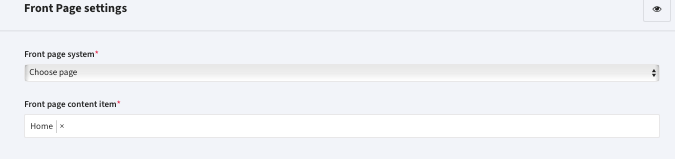
You can choose a page from the „Info Page” or „Landing page” list of created pages. This allows to crate a page with the page builder.
Alternatively you can choose „Build your front page here”.

Hero

Typically placed at the top of the front page, divided into two sections.

Welcome Section

By default, text is pulled from translations. Use personalization to dynamically display text based on user context.
Customizable Fields:
• Headline (not logged in)
• Headline (logged in, active course)
• Headline (logged in, no active course)
• Headline (coach with active group)
• Description (not logged in)
• Description (logged in, active course)
• Description (logged in, no active course)
• Description (coach with active group)
• Primary CTA (not logged in) – e.g., “Register to platform”
• Primary CTA (logged in, active course) – e.g., “Continue course”
• Primary CTA (coach) – e.g., “My Courses Panel”
• Explore courses – e.g., “Browse courses”
• Show „Headline when not logged in” to the logged in users that didn’t provide their name
• Show „Description when not logged in” to the logged in users that didn’t provide their name
• Show 'Explore courses’ when user is not logged in instead of 'Primary Call-to-Action when not logged in -> Register to platform’

Course/Image Section

Display a custom image or feature a recommended course.
• Fallback: If no course image is available, it defaults to the front page image.
• Image overlay applies to the entire section.
• Enable video.
How It Works
Explain how your platform works using a slider with multiple items.
• Headline – e.g., “How it works?”
• Description – e.g., Overview of your organization
• Background Image – Optional visual
• Overlay – Improves text readability
• Autoplay Slider – Requires at least two items
• Items – Each includes a title, description, and icon (e.g., from FontAwesome 4.7). Minimum of 3 items is recommended.
Featured Courses
Highlight selected courses in various layouts:
• Wide Rows – 1 per row; includes image, description, reviews
• Cards – 3 per row
• Two Columns – 2 per row
• Narrow Rows – 1 per row

User Testimonials

Display hand-picked testimonials in a carousel.
• Each includes Author and Testimonial Text.
• Autoplay requires at least 2 items. Minimum of 3 is recommended to avoid duplication.

Featured Course

Custom title The default the title is: „Featured courses”
Custom background Use custom background for this section
Centered header Center the header area above the course list
Big header Make header elements above the course list bigger
Course teaser layout Choose the layout style of your course teasers between:

  • Cards
  • Narrow rows
  • Wide rows
  • Spotlight
  • Two columns
Course teaser color style Choose color style for your course teasers between:

  • Default – White background and dark text.
  • Colorful: Color of choice as background and white text.
Course teaser display method


Course Library
Displays all course categories with customizable layouts.