Content that can be displayed in a teasers block:
Display order is configured in the module settings.
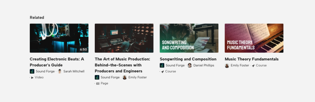
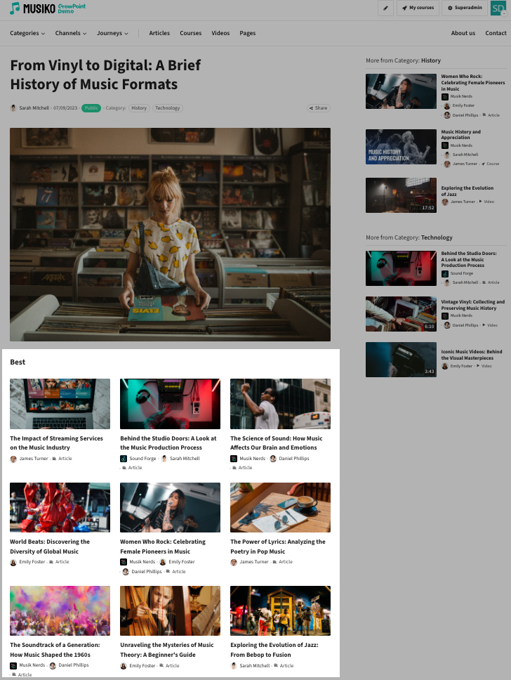
Example of a cards block view
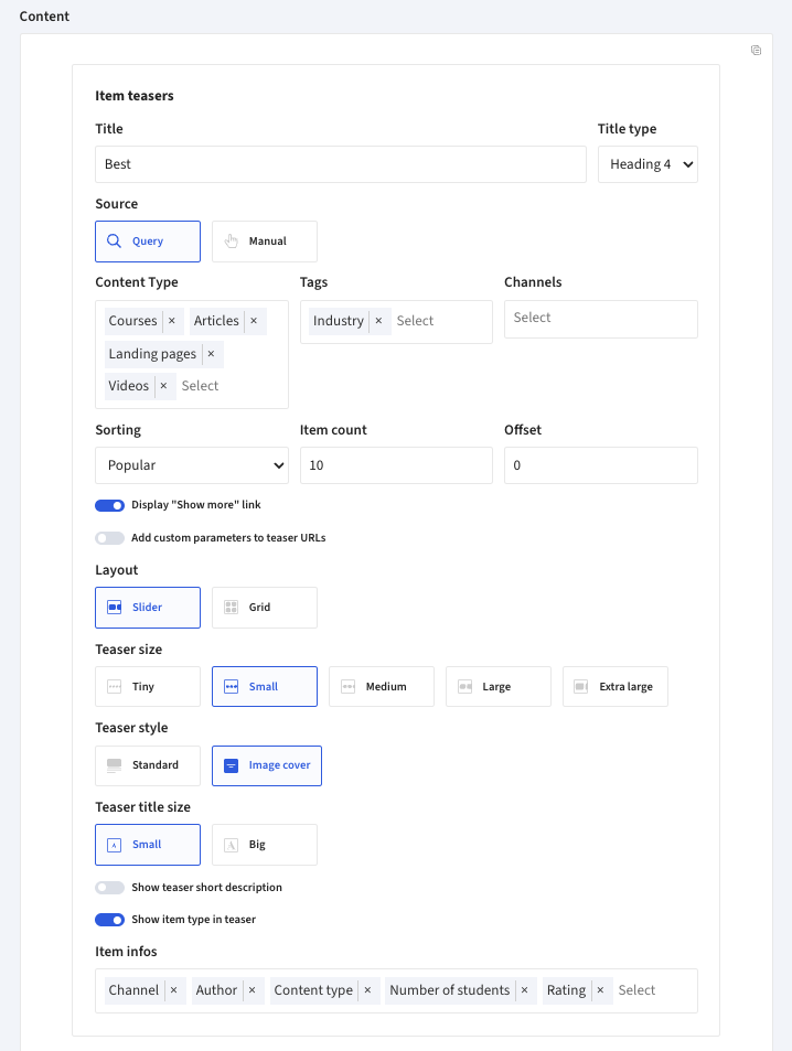
Setting options for the Cards block
| Title | Name and font size. |
| Source | The teasers can be chosen manually or set automatically-dynamically by specific criteria.
|
| Content type | Choice of Course, Article, Video and landing pages. Multiple can be chosen |
| Tags | Choice of available tags. Multiple can be chosen |
| Channels | Choice from available channels. Multiple can be chosen |
| Sorting | Decide what should be the order of displayed items. Options include:
|
| Item count | Sets how many items will be displayed in a sequence. |
| Offset | Sets the starting offset of showed content. Useful i.e. when combining multiple „Cards” blocks on one page |
| Display “Show more” link | Enable/disable „Show more” link |
| Custom URL parameters | Add custom parameters to links generated in this block (Useful i.e. for adding UTM or other parameters to teaser URLs) |
| Layout | Option of Slider or Grid view:
|
| Teaser size | Defined the size of the teaser |
| Teaser Style |
|
| Image placement | Setting the placement of the teaser window, choice of right or left. |
| Teaser title size | Choice of the size of font of the teasers module name. |
| Show teaser short description | Display/hide content description |
| Show boarder around teaser | Display/hide content border |
| Show item type in teaser | Display/hide content type |
| Item infos | Choice of multiple options of displaying additional information to the teaser’ed content like: Add metadata (author, channel, rating, publish date, etc.). ⚠️ Note: Enabling too many metadata options may negatively impact layout. |
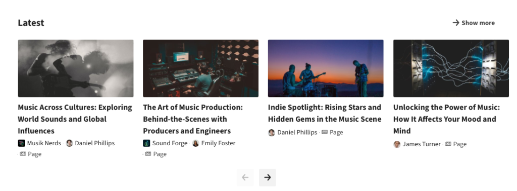
Example of a teasers block with Slider layout and medium size
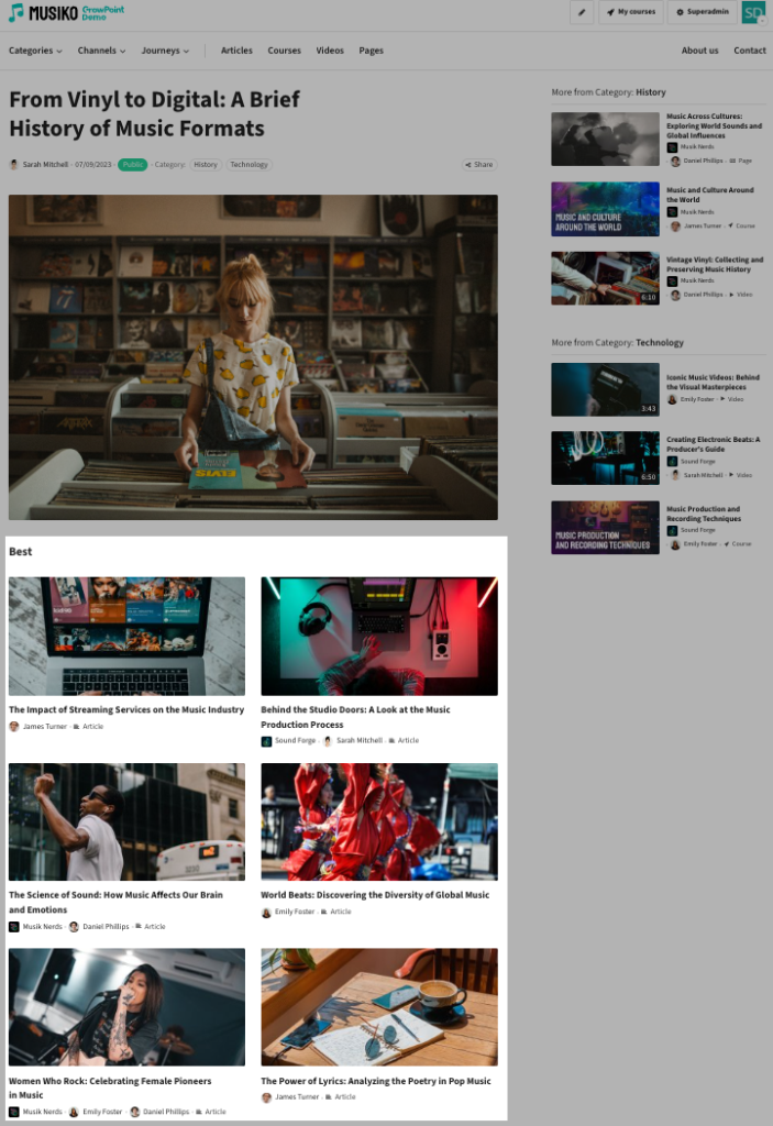
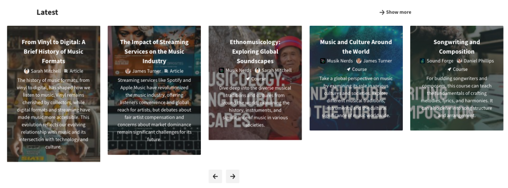
Example of a teasers block with grid layout and medium size
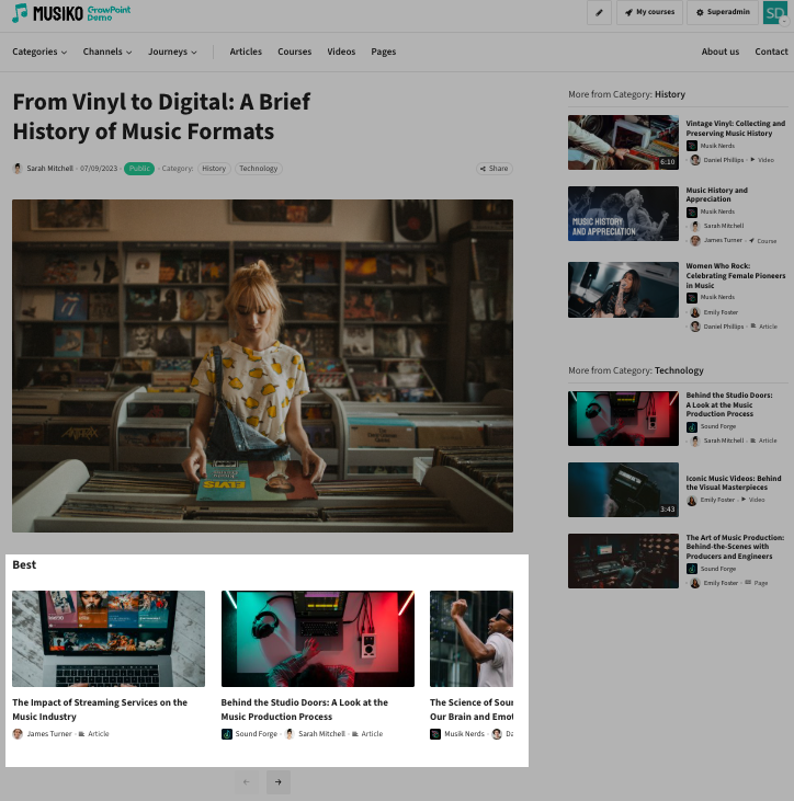
Example of a teasers block with Grid layout and tiny size
Teaser slider with description under the window
Teaser slider with description in the window
