Branding settings are customisation options that allow organisations to tailor the platform’s visual identity to align with their brand.
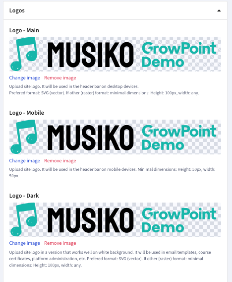
Fields for upload of logos
| Logo – Main | Main logo shown on the website header, desktop version |
| Logo – Mobile | Main logo shown on the website header, mobile version (can be the same as the „Logo – Main”) |
| Logo – Dark | A version of a brand’s logo specifically designed to be used on light or white backgrounds |
| Favicon | Small icon displayed in the browser tab, must be in square format |
| Progresive web app logo | Logo displayed as a Progressive Web App icon on a device screen, must be square and at least 512x512px |
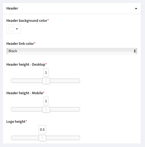
Header setting window
| Header background color | The header background color applied to the background of the platform’s header section |
| Header link color | Displayed text color of header hyperlinks |
| Header height – Desktop | Desktop-only header vertical height settings |
| Header height – Mobile | Mobile-only header vertical height settings |
| Logo height | Main logo vertical height (as a proportion of the header bar) |
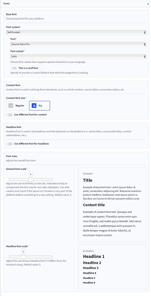
Fonts settings window
| Base font |
Choice of:
|
| Font | Choice of font from a dropdown list |
| Font subset |
Choice of:
|
| This is a serif font | Specify to provide a correct fallback font while the target font is loading |
| Content font size | Content font is used in all long-form text pieces: course content, course homepage, articles, etc. |
| Use different font for content | Decide if the platform should use a different font for long-form content pieces |
| Use different font for headlines | Decide if the platform should use a different font for headlines |
| General font scale | Adjust the size of all fonts on the site |
| Headline font scale | Adjust the size of your headline font if it differs from the standard sizing |
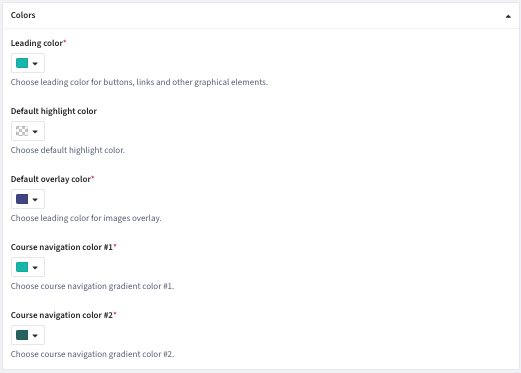
| Leading color | Choose leading color for buttons, links and other graphical elements |
| Default highlight color | Choose default highlight color |
| Default overlay color | Choose leading color for image overlays |
| Course navigation color #1 | Choose course navigation gradient color #1 |
| Course navigation color #2 | Choose course navigation gradient color #2 |
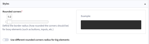
| Rounded corners | Define the border radius (how rounded the corners should be) for boxy elements |
| Use different rounded corners radius for big elements | Allows different radiuses for larger and smaller items |
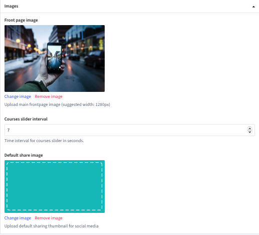
| Front page image – Change image | Upload main front page image (Legacy Front Page) |
| Courses slider interval | Time interval for courses slider in seconds (Legacy Front Page) |
| Default share image – Change image | Upload default sharing thumbnail for social media |
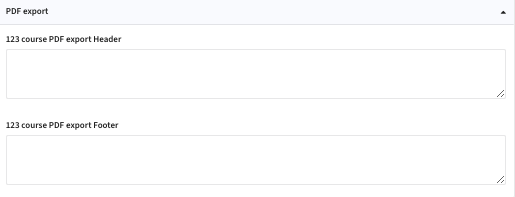
| 123 course PDF export Header | PDF export Header text |
| 123 course PDF export Footer | PDF export Footer text |
