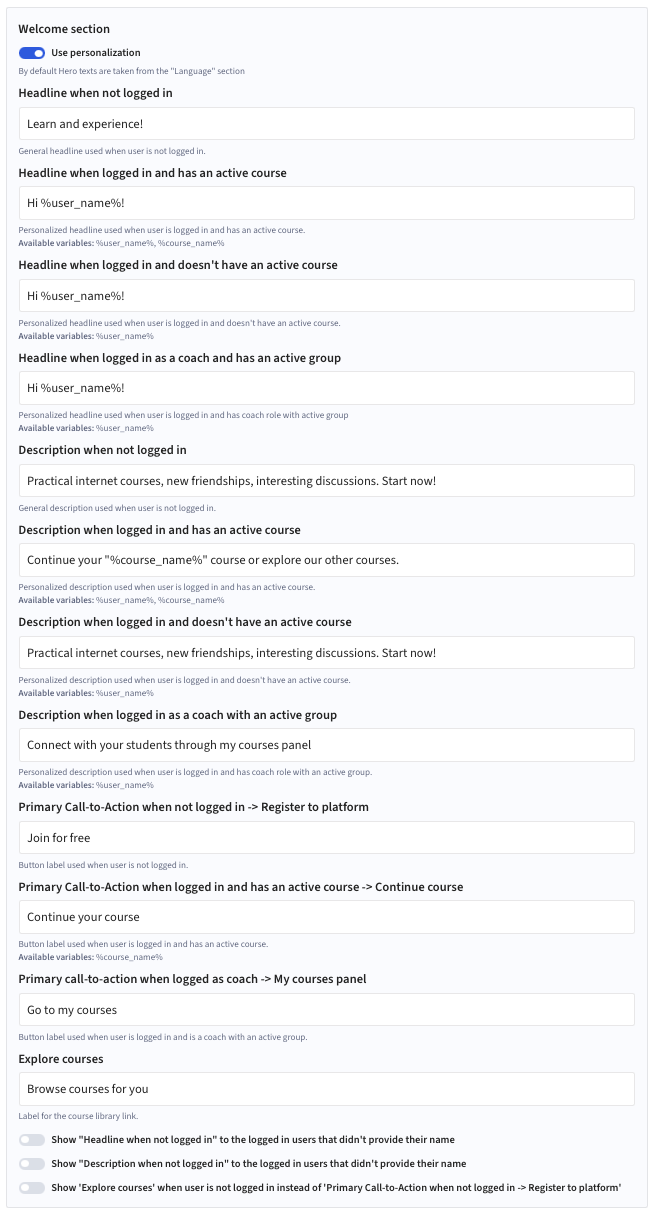
The main landing page that introduces users to the site. It typically provides an overview of the product or project, key links to sections. Its primary purpose is to help users quickly orient themselves and navigate to relevant content.
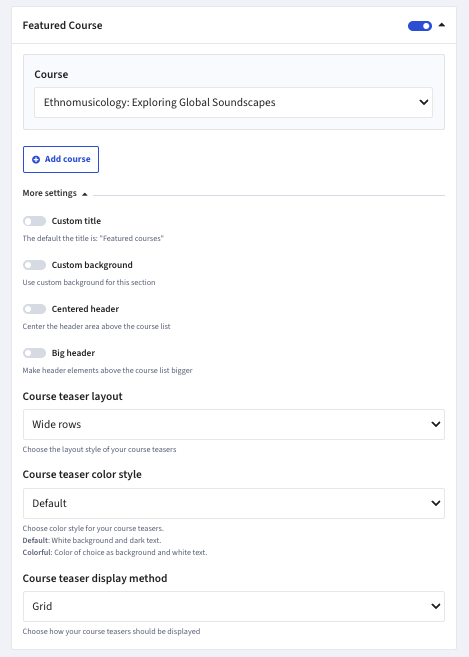
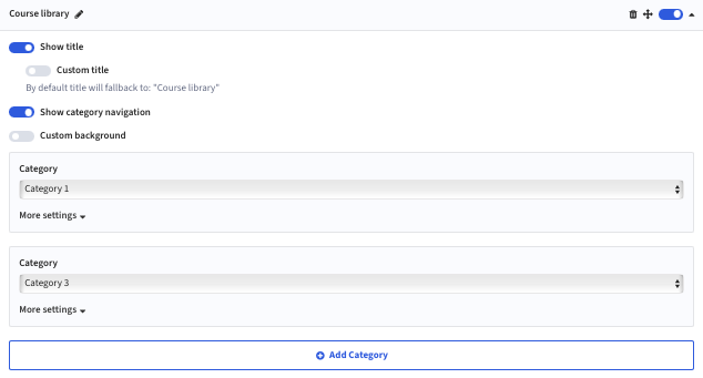
| Custom title | The default the title is: „Featured courses” |
| Custom background | Use custom background for this section |
| Centered header | Center the header area above the course list |
| Big header | Make header elements above the course list bigger |
| Course teaser layout | Choose the layout style of your course teasers between:
|
| Course teaser color style | Choose color style for your course teasers between:
|
| Course teaser display method |